The Impact
Every design tells a story—and in this case, the website needed to tell one too.
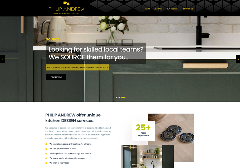
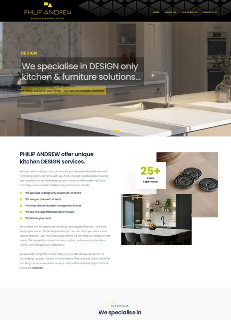
Not your typical kitchen company, a high-end design consultation firm, blending artistry with architecture—where every project starts with a sketch and ends with a stunning, custom-built kitchen or living space. They don’t just design; they design, manage, and source—bringing projects to life in partnership with trusted local suppliers.
We partnered with the lead designer of the firm to create a site that reflected their process, personality, and precision. The result? A website that feels as bespoke and considered as the spaces they create.
The Brief
From the start, it was clear: the website couldn’t just “showcase kitchens.” It needed to:
Tell the story of the design journey
Reflect the elevated, collaborative nature of their work
Feel crafted, thoughtful, and premium
Clearly communicate their unique process:
Design | Manage | Source
The goal was more than leads—it was alignment with the right kind of client.
Collaboration
This was a creative collaboration with the company’s lead designer—who brought a vision not only for the brand but for how the user should feel moving through the site.
Together, we approached the project like a shared design brief:
- Moodboards and visual language to set the tone
- A sitemap that mirrored their design process
- Layouts inspired by architectural rhythm and white space
The Impact
What we built wasn’t just a website—it became a digital portfolio that clients instantly connected with. It:
- Elevated the firm’s perceived value and professionalism
- Attracted inquiries from clients aligned with their vision
- Reflected their creative integrity and collaborative process
- Helped differentiate them in a crowded, price-focused market
From Sketch to Structure
We showcased their process visually—pairing hand-drawn sketches, 3D renders, and final project photos. This allowed users to experience the evolution of a space, not just the end result.
Whitespace & Simplicity
We used an airy, minimalist design with space to breathe—mirroring the clean, thoughtful interiors they create. Typography and layout were chosen to feel editorial and refined.
Guided User Journey
The site was structured around their process:
Design – In-depth consultation and conceptual work
Manage – Project coordination and oversight
Source – Working with local suppliers to bring the vision to life
Each section told a piece of the story, ending in curated calls to action.
Visual-First Approach
Projects were showcased through large-format imagery, with subtle motion and transitions to reflect the hands-on design work behind them.
Case Studies as Stories
Each featured project included:
Initial design concept (sketch or brief)
Rendered 3D visualizations
Final install photography
Notes on materials, client goals, and unique challenges